I) What are the different components of the infographic?
II) How to access the data?
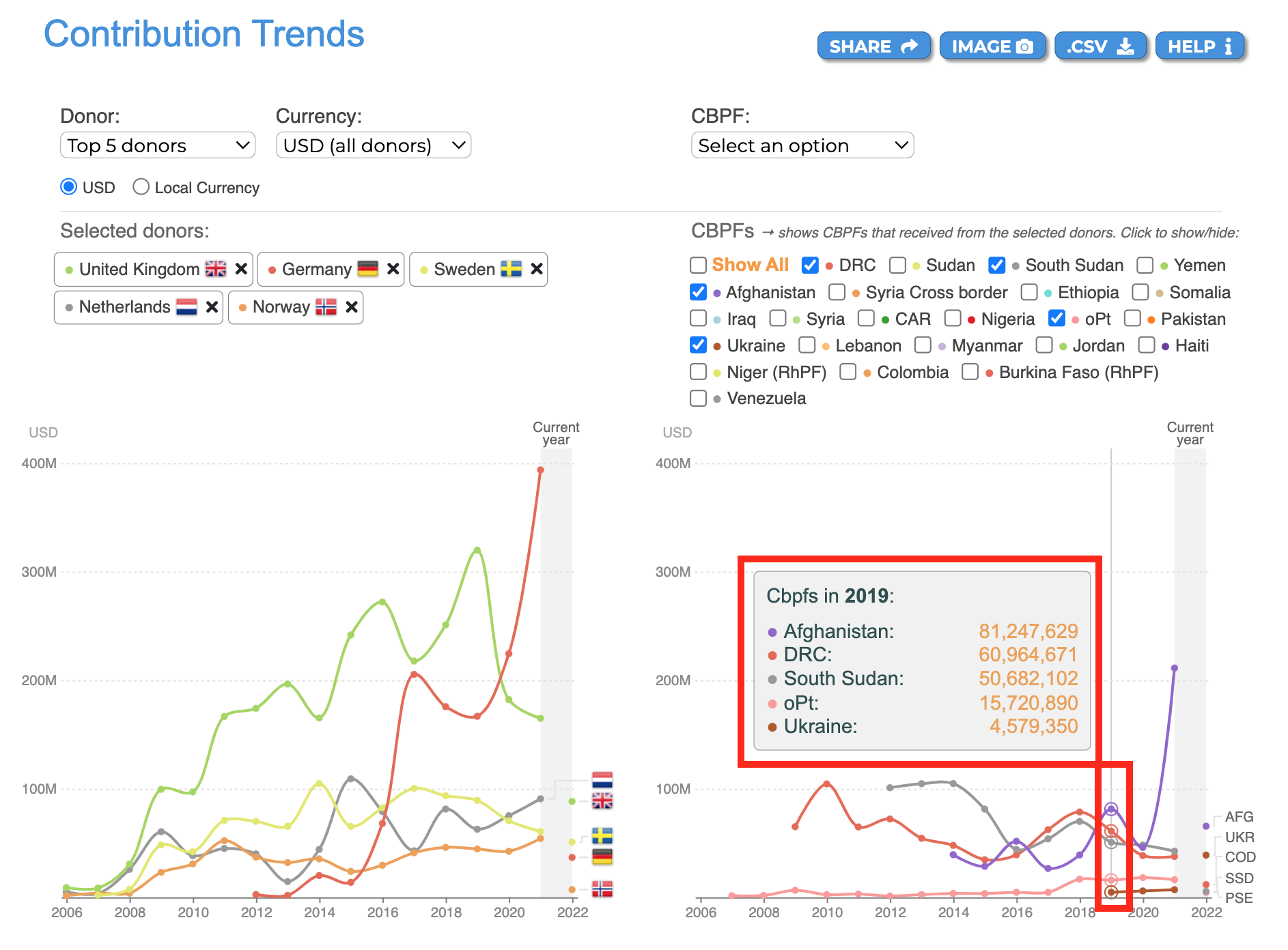
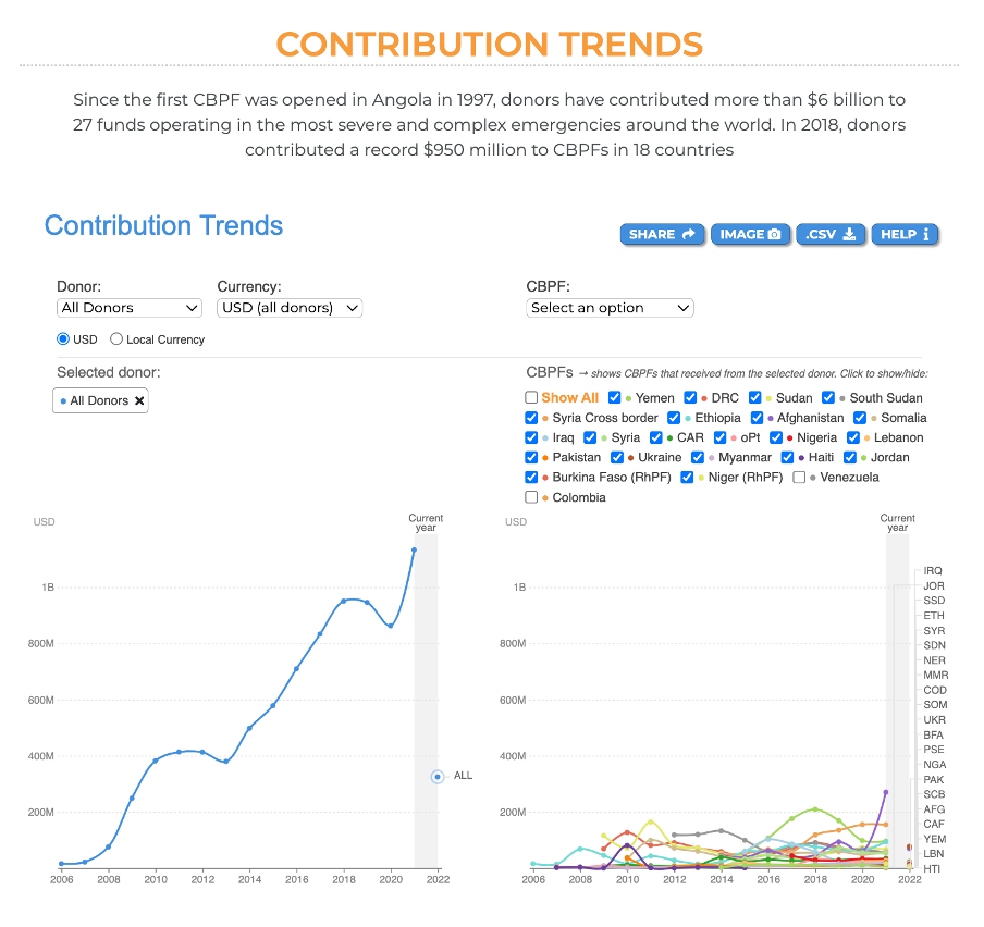
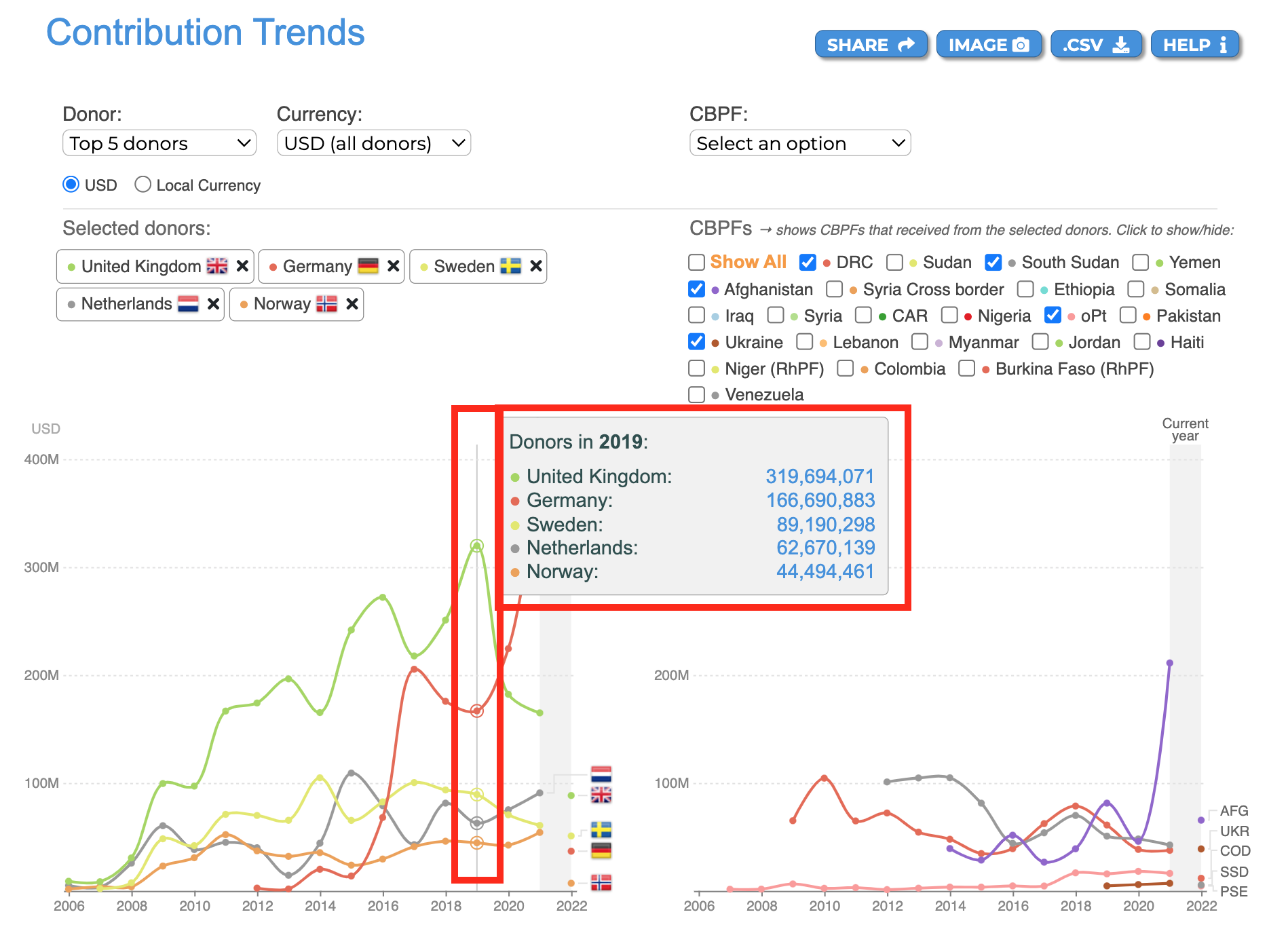
This visual analyses the trends of contributions made by donors to CBPFs throughout the years.
I) What are the different components of the infographic?
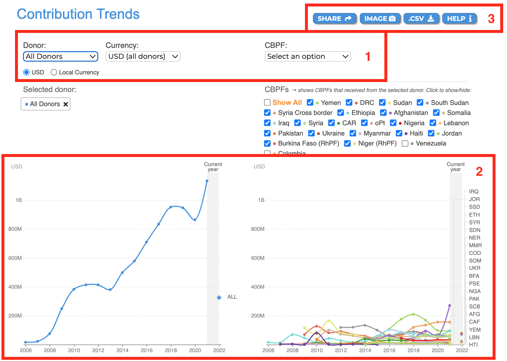
Please see below the description of fields 1-3 as annotated in red in the screenshot above.
-
The filters option: users can apply these filters to personalise the data.
a. Donor: select from the drop-down list a donor, the top 5 donors, or all donors.
b. Currency: select from the drop-down list one currency. You can also select the local currency of the donor’s country. If you select several donors, they must have the same currency to be able to choose the local currency.
c. CBPF: select from the drop-down list one fund, all funds, or the top 5 CPBFs. You can select several funds by selecting them from the list below. -
The visualisation:
a. Donors’ line chart: displays the amount contributed by year since 2006.
b. CBPFs line chart: displays the amount received by year since 2006. -
The usual CBPF Data Hub tooltips: Share, Play, Image, .CSV, and Help. To know more about these tooltips, please click here.
From the donors’ chart, hover over the node (which represents a year) to see the total contributions of the selected donor(s).
From the CBPFs’ chart, hover over the node (which represents a year) to display the amount received by the selected fund(s).