|
|
What is the OCHA Pooled Funds Data Hub?
The United Nations Office for the Coordination of Humanitarian Affairs (UNOCHA) manages two types of Pooled Funds: the Country Based Pooled funds (CBPFs) and the Central Emergency Response Fund (CERF).
The OCHA Pooled Funds Data Hub portal is a one-stop data visualization platform which delivers both CBPF and CERF Allocations and Donor Contributions data, making it the only information management tool to bring together real-time OCHA Pooled Funds’ data.
It is accessible at this address: https://pfdata.unocha.org/
Through its interactive, on-target visualizations, the PF Data Hub contributes to enhance humanitarian information management for better decision making.
Intended for all users who wish to analyze and learn more about the Pooled Funds figures and trends, the OCHA PF Data Hub data is live and publicly available for everyone to use, download and share.
Drawing its data from the CERF and CBPF Grant Management Systems, the PF Data Hub is composed of:
- The Allocations map and bar chart, which delivers data on funding allocated to Humanitarian Partners;
- Two data visualizations dedicated to Donor Contributions providing multi-year comparison and contributions trends per Donor.
You can download our PDF on the Pooled Funds Data Hub HERE.
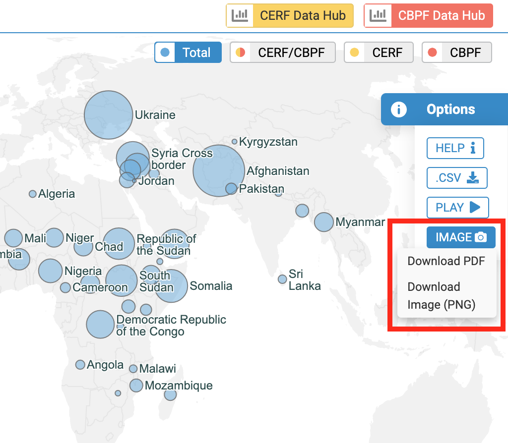
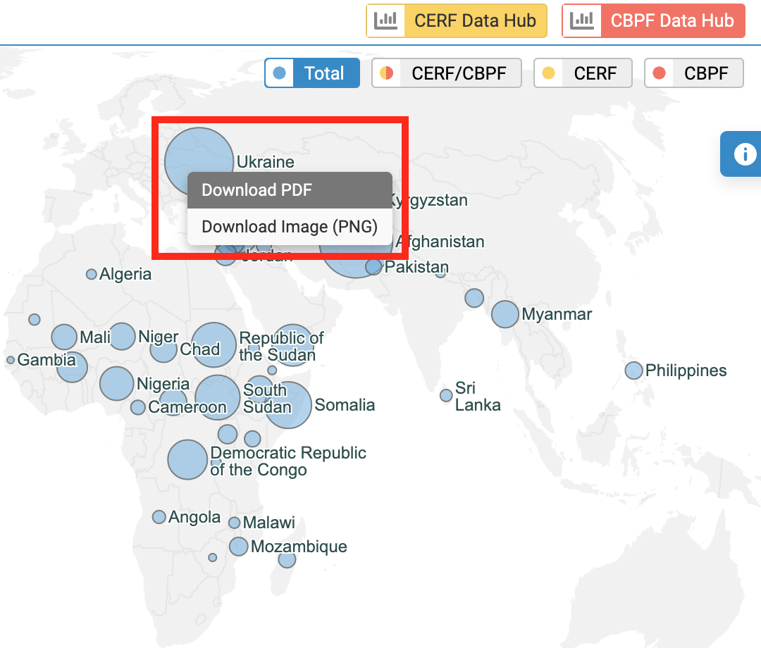
 on the right-hand side of the screen, which will open the "Options" panel. Then, click on [.CSV]. The metadata of the visual will be downloaded onto your computer and accessible from the "Downloads" folder of your desktop.
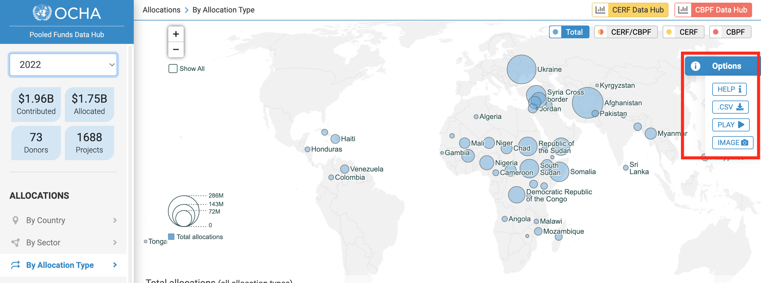
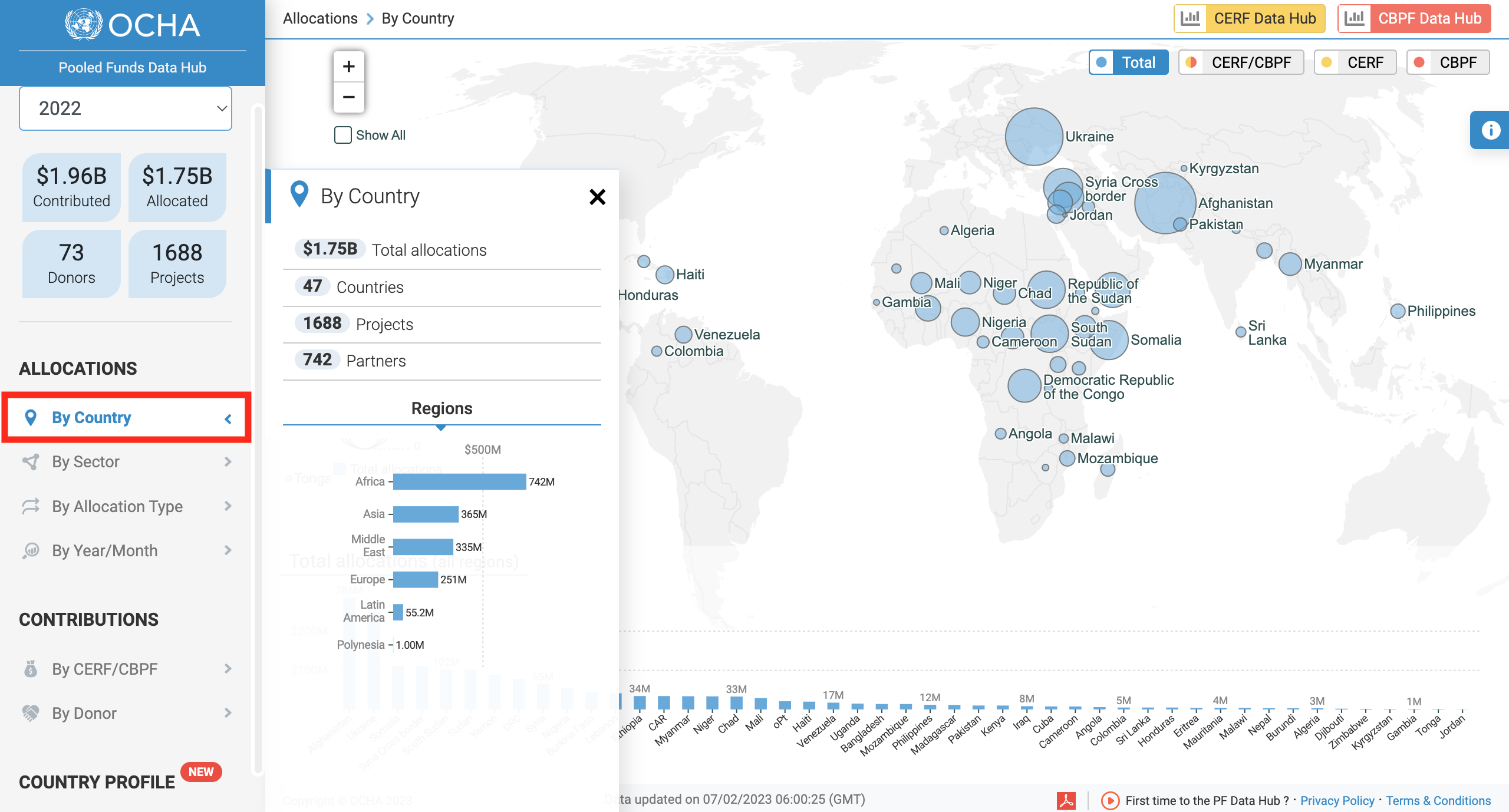
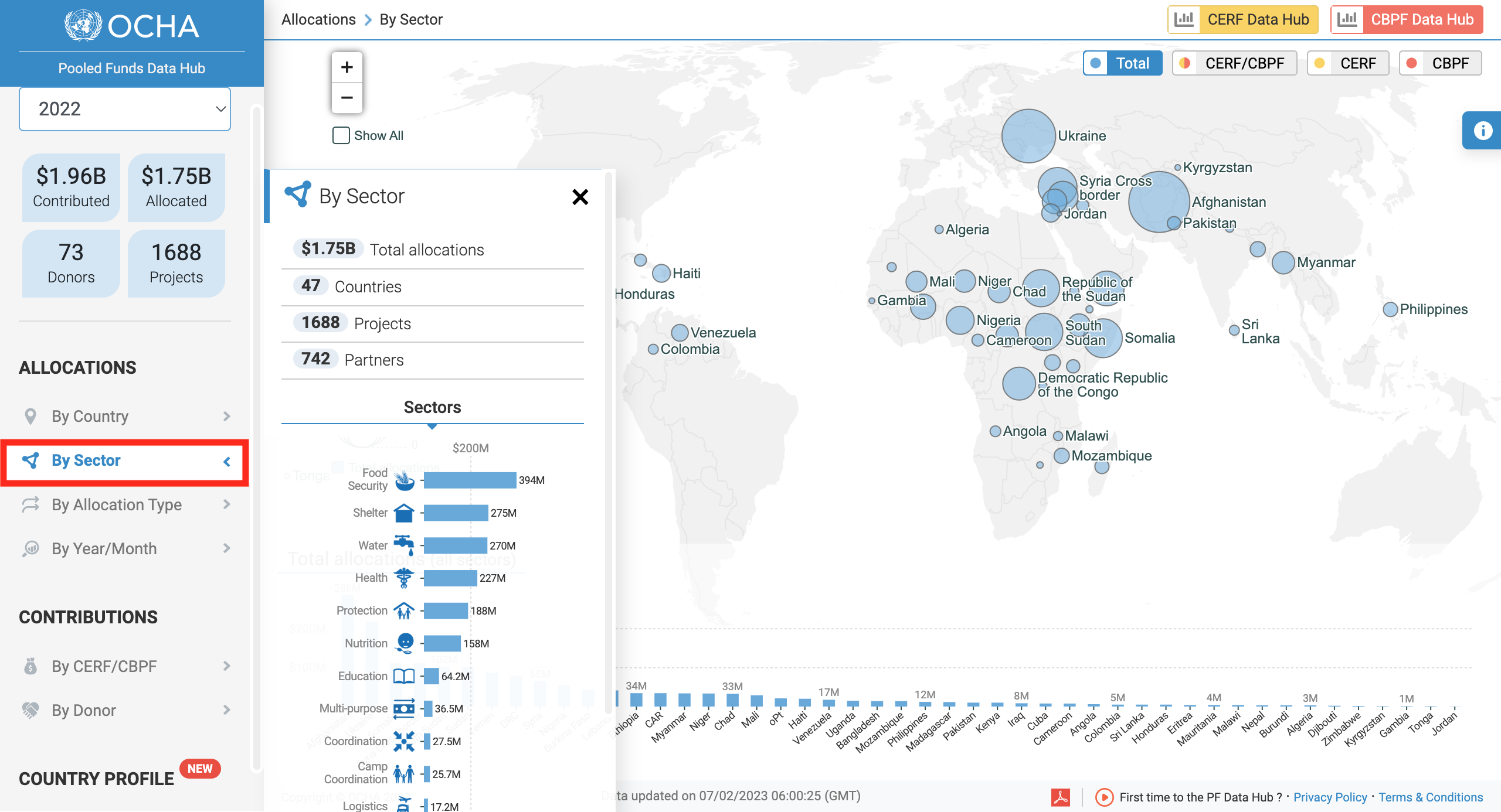
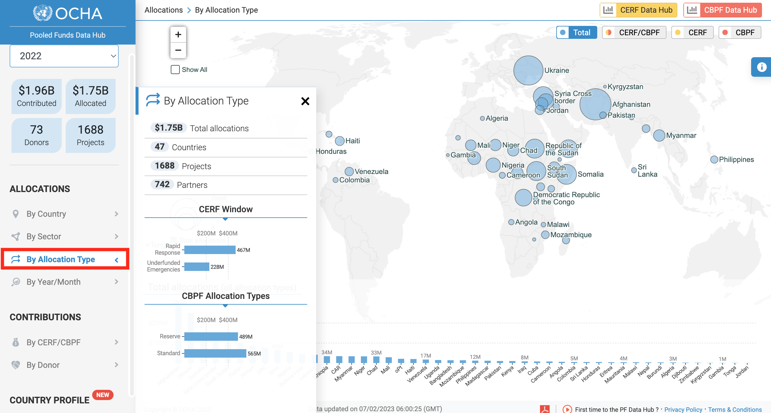
Drawing its data from the CERF and CBPF Grant Management Systems, the Allocations map and bar chart of the PF Data Hub delivers data on funding allocated to Humanitarian Partners.
The PF Data Hub includes filtering options, aimed at improving data analysis. Users can view the allocation figures by country or region, by sector (cluster), by allocation type or by year/month.
This visual is highly interactive, and offers a wide array of filters, as shown in the screenshot/legend below:
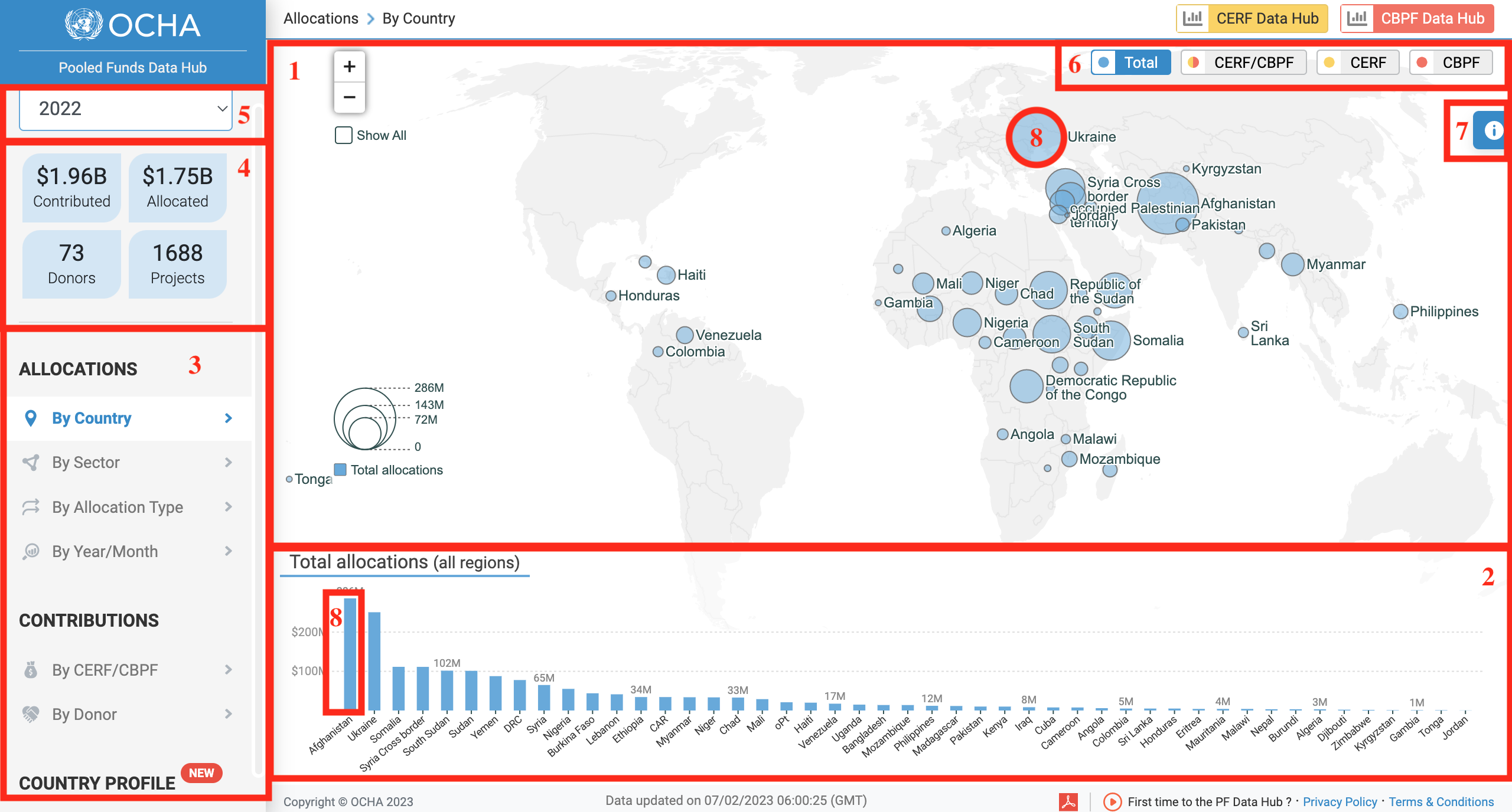
- Allocations' map
- Allocations' bar chart
- Select te visual you wish to display
- These figures reflect your data selection
- Select a year
- You can filter this map's and bar chart's data by displaying the funding as a total, a colour-coded split between CERF and CBPF, view only CERF or CBPF or display data for CERF or CBPF only
- Click here to show the options' panel, enabling users to download the data
- you can hover over a country's circle or bar chart to access additional information
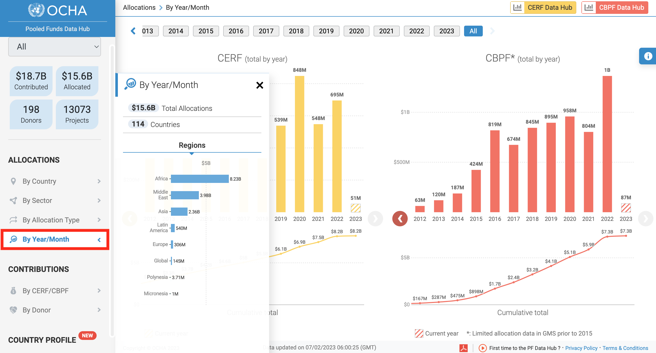
The PF Data Hub dedicates two data visualization to Donors' contributions, resulting in increased visibility and faciliating strategic planning.
These visuals, By CERF/CBPF and By Donor, allow a multi-year comparison as well as a contributions trends analysis by fund and by donor.
The 'By CERF/CBPF' visual displays the contributions paid or pledged from countries and donors to the Pooled Funds, CERF and CBPF. You can also see the total cumulative contributions paid or pledged.
By default, all years are selected. However, you can single out one year's data, or select several years to see a multi-year comparison, with a break-down by month. Filters also allow you to dissociate the paid and pledged amounts.
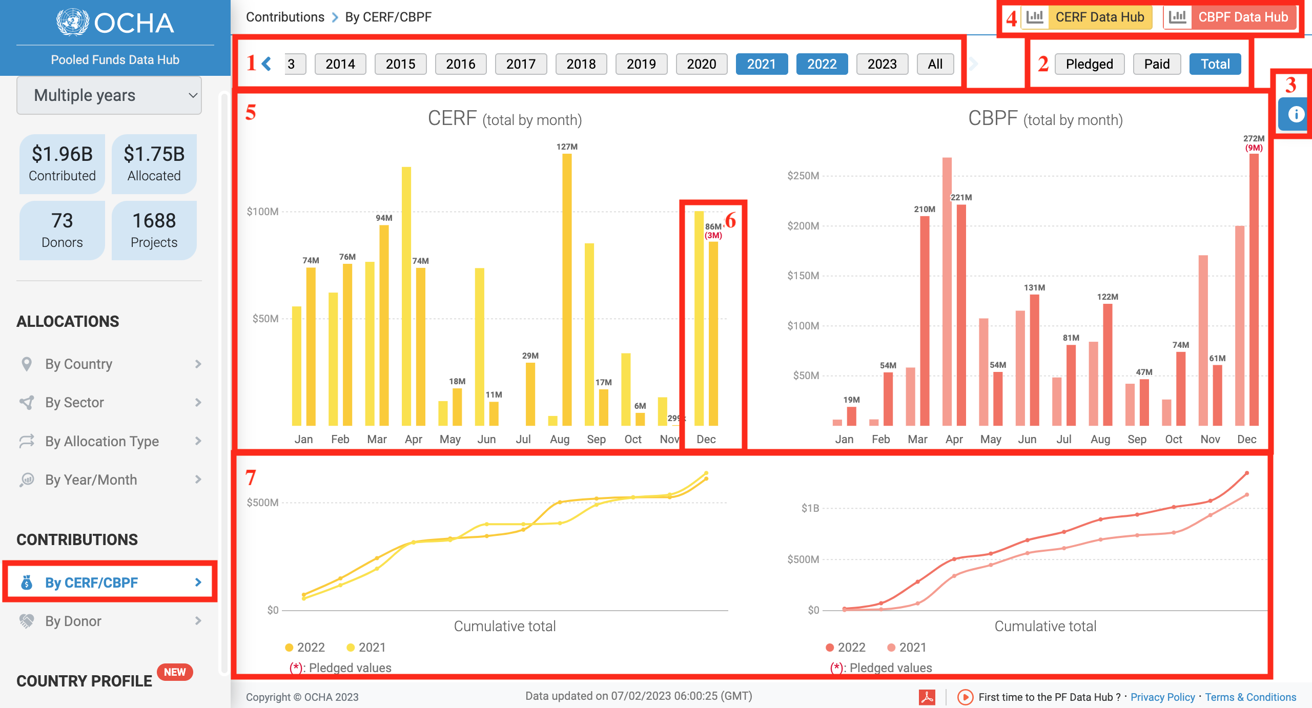
- Timeline: select one or up to four years from this timeline. By default, all years (button at the far right of the timeline) are selected.
- These filters allow you to either display the Pledged amount, the paid amount or the total amount.
- Hover over this icon to access the Options' panel from which you can extract the data as an Excel sheet (.CSV), as an image (PDF or PNG) or see an animation of the data throughout the years.
- Click on either of these icons to be redirected to their dedicated Business Intelligence Platforms, on which you will have access to more information.
- The CERF and CBPF contributions bar chart.
- Hover over a bar chart to show more information on the donors’ contributions.
- The line chart displays the total cumulative contributions for CERF and CBPF. You can hover over a nod to show more information.
The ‘By Donor’ visual displays the contributions data and trends by donor. You can enlarge a graph by clicking on the cross. Users can choose to show the total contributions by country, the contributions for CERF and CBPF together, or the contributions for CERF or CBPF.
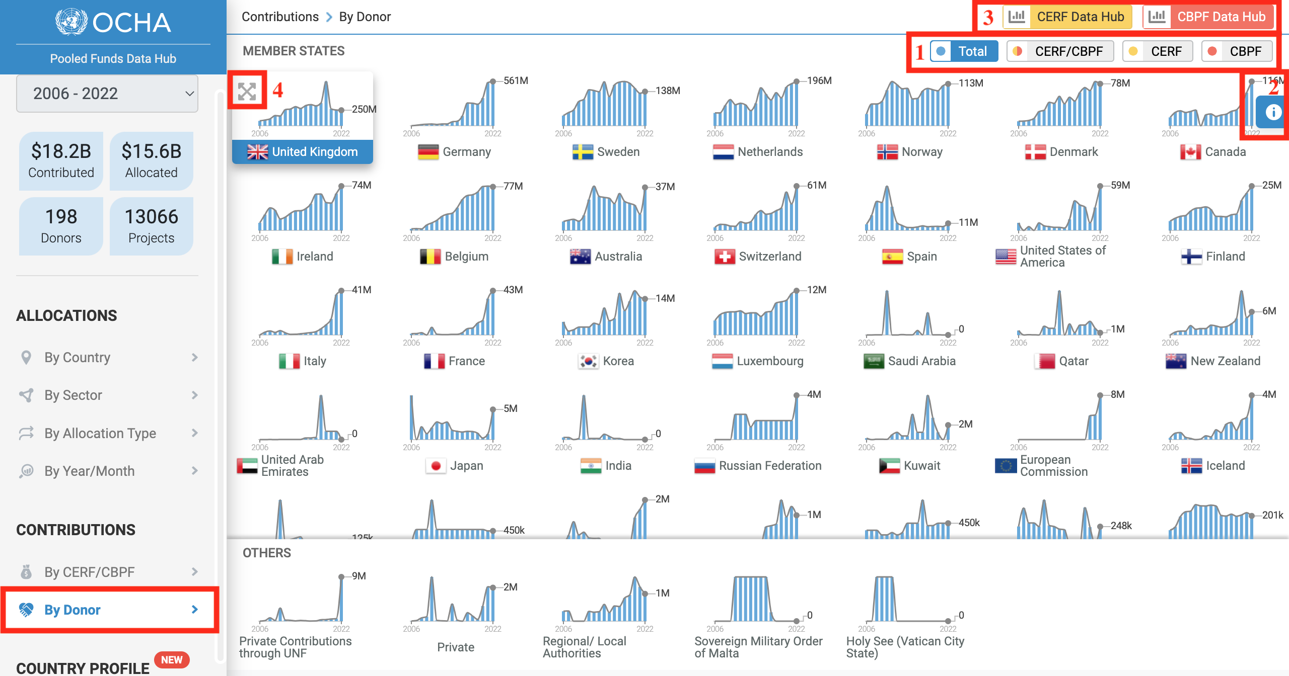
- You can display the total contributions by country, the contributions for CERF and CBPF together or the contributions for CERF or CBPF.
- Hover over this icon to access the options' panel, from which you can extract the data as an Excel sheet (.CSV), as an image (PDF or PNG) or see an animation of the data throughout the years.
- Click on either of these icons to be redirected to their dedicated Business Intelligence Platforms, on which you will have access to more information.
- Click on this cross to view an enlarged version of the graph.
This interactive dashboard called "Country Profile" allows users to browse the country profile around allocations and contributions of CERF and CBPF and generate an interactive dashboard/report with the defined filters to select.
The dashboard presents first an overview of CERF and CBPF allocations by country and region.
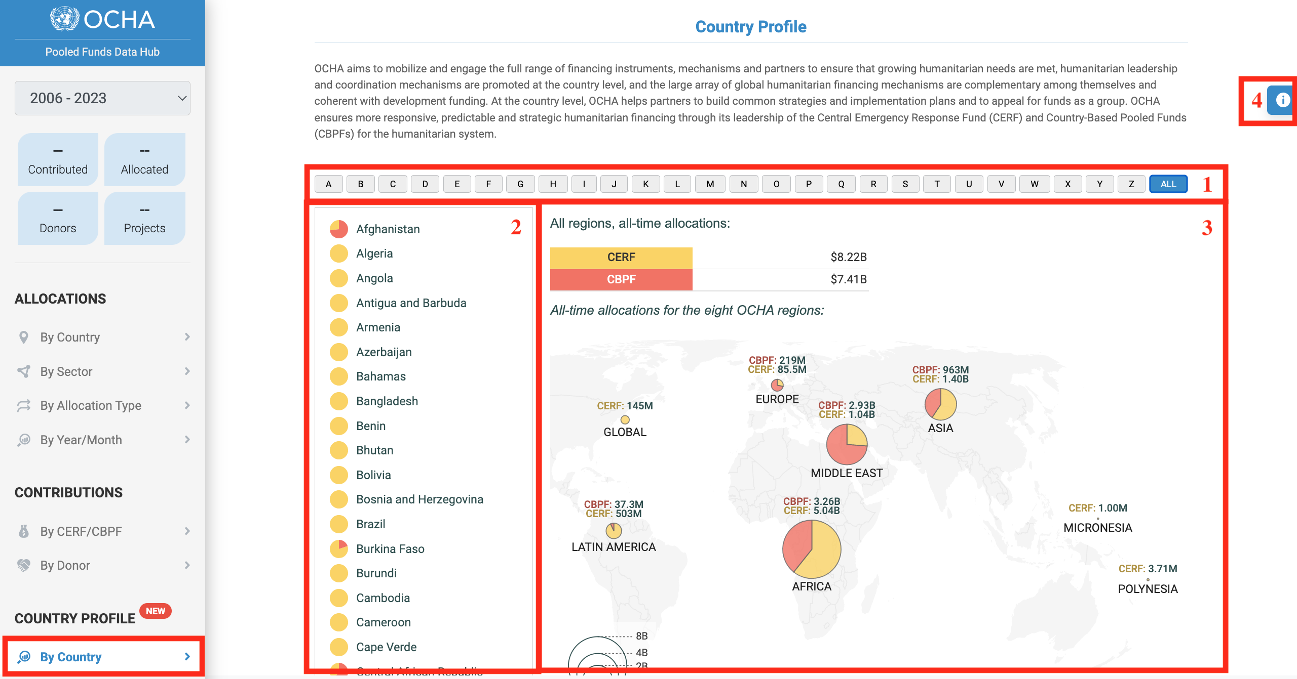
- You can either display all the countries by clicking on [All] or select a letter to display all countries starting with the letter of your choice.
- The list of countries. You can click on a country to open its profile.
- The visual represents CERF and CBPF allocations by region.
- Hover over this icon to access the options' panel, from which you can extract the data as an Excel sheet (.CSV), as an image (PDF or PNG) or see an animation of the data throughout the years.
To open a country’s profile, click on the country from the list. The county profile provides an overview of allocations, allocations by partner, allocations by sector, allocations by partner/sector, and contributions by donors.
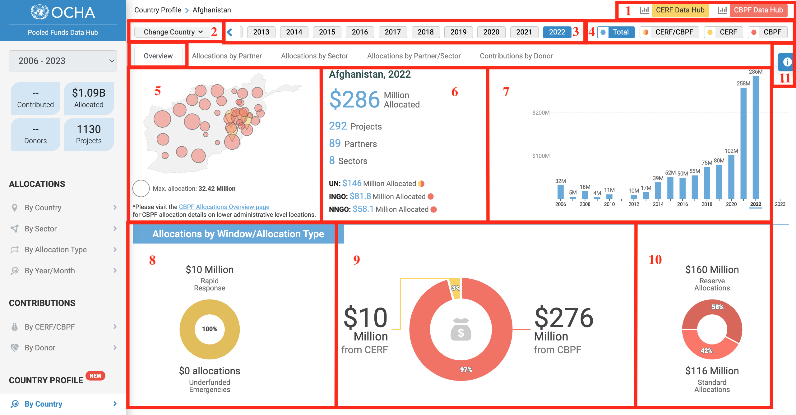
- Click on either of these icons to be redirected to their dedicated Business Intelligence platform for more information.
- Click on this drop-down to select another country and open its profile.
- Select the year.
- You can either display the overview for CERF and CBPF without distinction, the overview for CERF and CBPF with a colour code distinction or the overview for CERF or CBPF only.
- This map shows the total of CERF and CBPF allocations. You can hover over the red or yellow icon to display the name of the location and the total amount.
- This is an overview of the total allocation, the number of projects, partners and sectors it funded and its distribution among partner types.
- This bar chart shows the total allocated by year. You can hover over a bar to display the total amount.
- This pie chart presents the distribution of CERF allocations between Rapid Response and Underfunded Emergencies windows.
- This pie chart displays the share and amount of CERF and CBPF allocations against the total allocations.
- This pie chart shows the distribution of CBPF allocations between Reserve Allocations and Standard Allocations.
- Hover over this icon to access the options' panel, from which you can extract the data as an Excel sheet (.CSV), as an image (PDF or PNG) or see an animation of the data throughout the years.
The Allocation by Partner visual shows the distribution of allocations among partners for a given year and country.
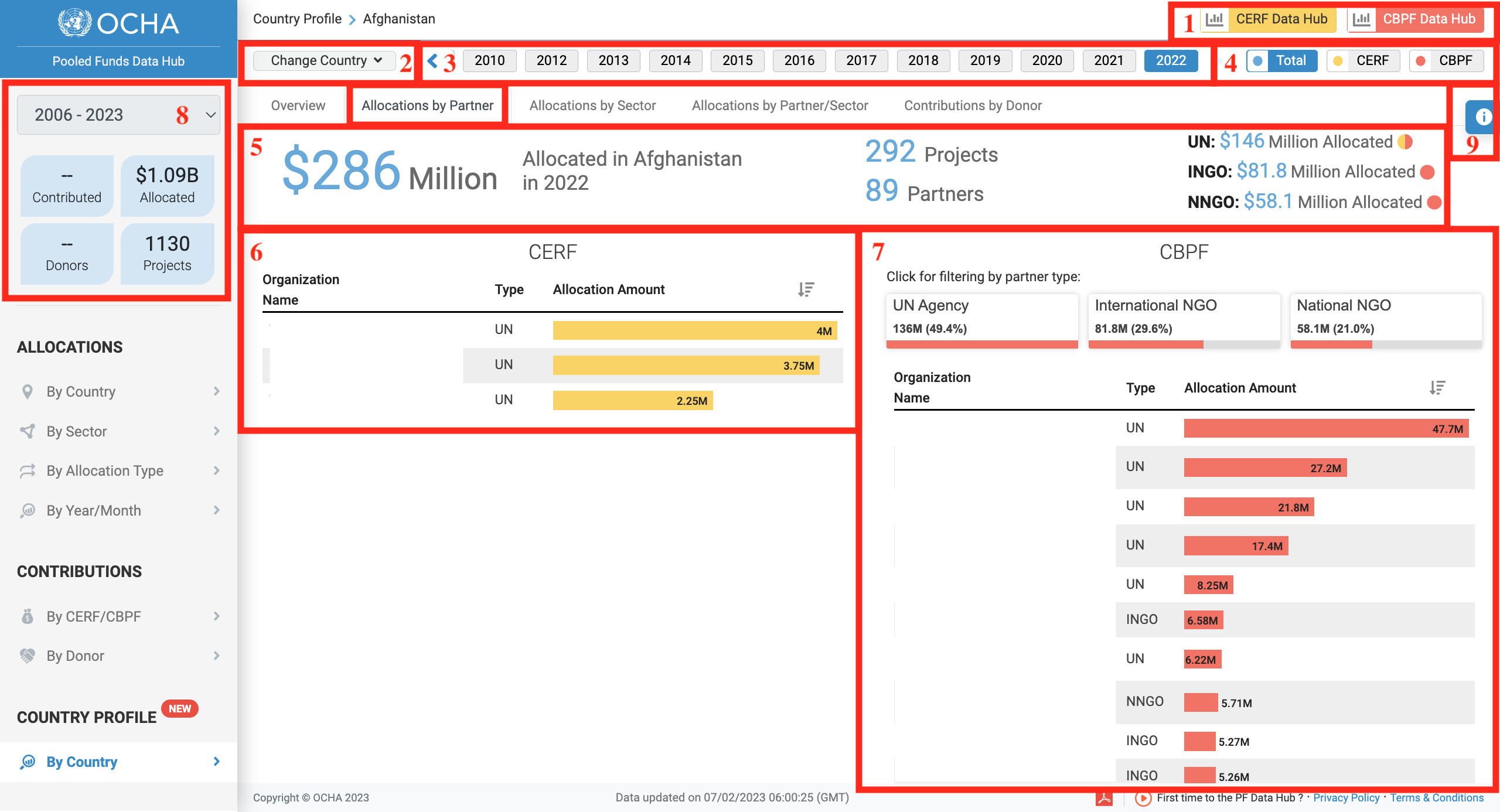
- Click on either of these icons to be redirected to their dedicated Business Intelligence platform for more information.
- Click on this drop-down to select another country and open its profile.
- Select the year.
- You can either display the data for CERF and CBPF or for CERF or CBPF only.
- This is an overview of the total allocation, the number of projects and partners it funded and its distribution among partner types.
- This bar chart displays the distribution of CERF allocations among agencies. You can hover over a bar to display more information.
- This bar chart displays the distribution of CBPF allocations among partners. You can click on a partner type to filter the chart and hover over a bar to display more information.
- This section provides information on the total amount allocated and total amount of project funded by CERF and CBPF in the given country since 2006.
- Hover over this icon to access the options' panel, from which you can extract the data as an Excel sheet (.CSV), as an image (PDF or PNG) or see an animation of the data throughout the years.
The allocation by sector visual presents the distribution of allocations by sector for a given country and year.
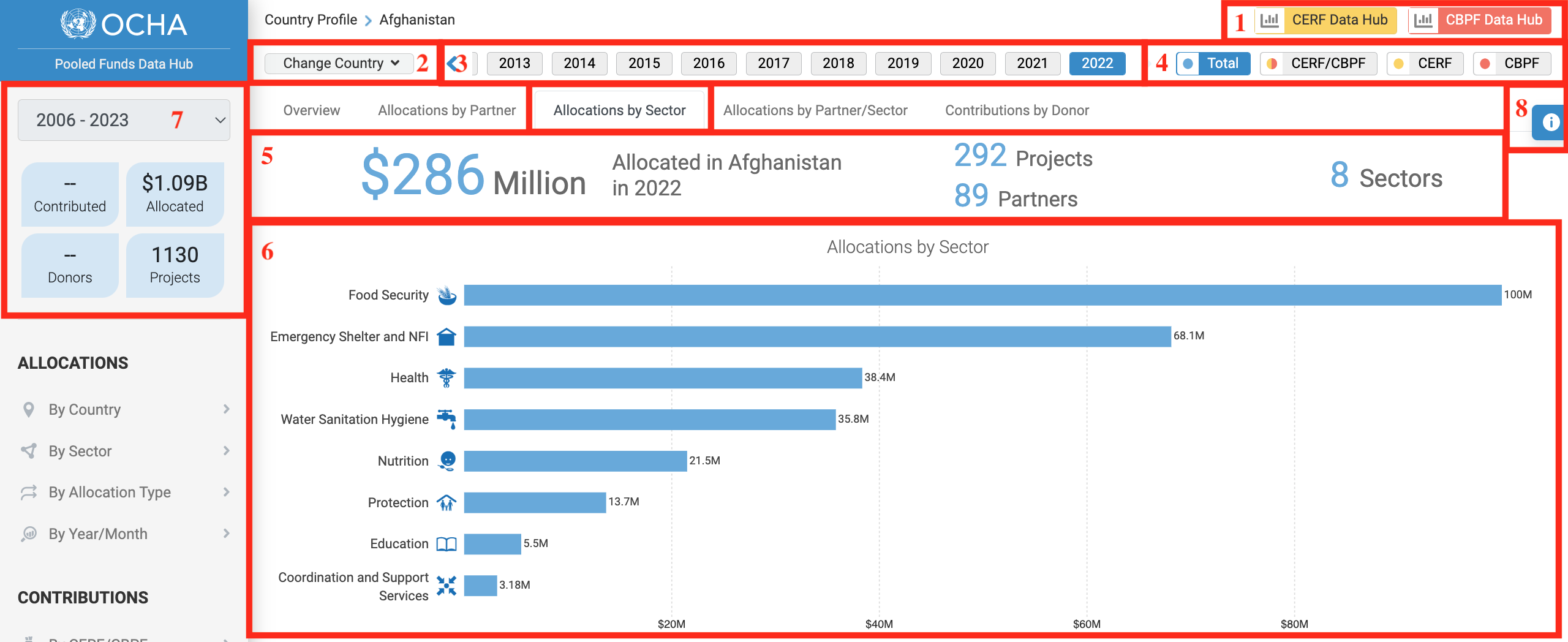
- Click on either of these icons to be redirected to their dedicated Business Intelligence platform for more information.
- Click on this drop-down to select another country and open its profile.
- Select the year.
- You can either display the data for CERF and CBPF without distinction, for CERF and CBPF with a colour code distinction or for CERF or CBPF only.
- This is an overview of the total allocated amounts and the number of projects, partners, and sectors that were funded.
- This bar chart shows the distribution of the allocation by sector.
- This section provides information on the total amount allocated and total amount of project funded by CERF and CBPF in the given country since 2006.
- Hover over this icon to access the options' panel, from which you can extract the data as an Excel sheet (.CSV), as an image (PDF or PNG) or see an animation of the data throughout the years.
4) Allocation by Partner/Sector
This visual shows the distribution of CERF and CBPF allocations by partner and sector.
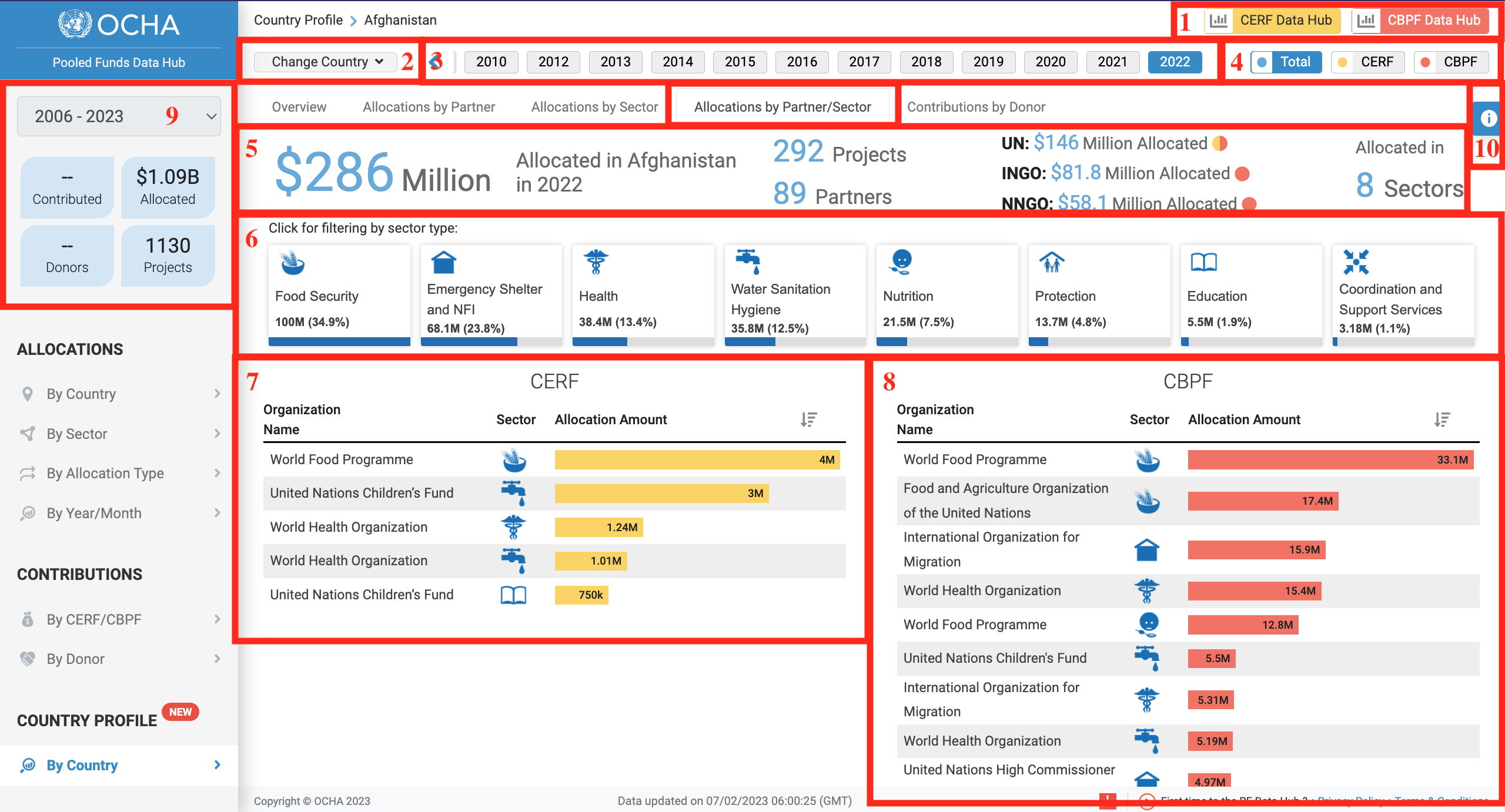
- Click on either of these icons to be redirected to their dedicated Business Intelligence platform for more information.
- Click on this drop-down to select another country and open its profile.
- Select the year.
- You can either display the data for CERF and CBPF without distinction or for CERF or CBPF only.
- This is an overview of the total allocated amount, the number of projects, partners and sectors that were funded and the distribution of funds among partner types.
- These filters show the amount and the share of the allocation allocated to each sector. You can click on a sector to only display the sector’s data on the CERF and CBPF bar charts below.
- This bar chart provides data on the amount allocated by CERF by sector and agency.
- This bar charts provides data on the amount allocated by CBPF by sector and partner.
- This section provides information on the total amount allocated and total amount of project funded by CERF and CBPF in the given country since 2006.
- Hover over this icon to access the options' panel, from which you can extract the data as an Excel sheet (.CSV), as an image (PDF or PNG) or see an animation of the data throughout the years.
The Contributions by Donor visual displays the pledged and paid contributions by donor for a given country and year.
Please note that all contributions made by donors to CERF are available on the CERF website
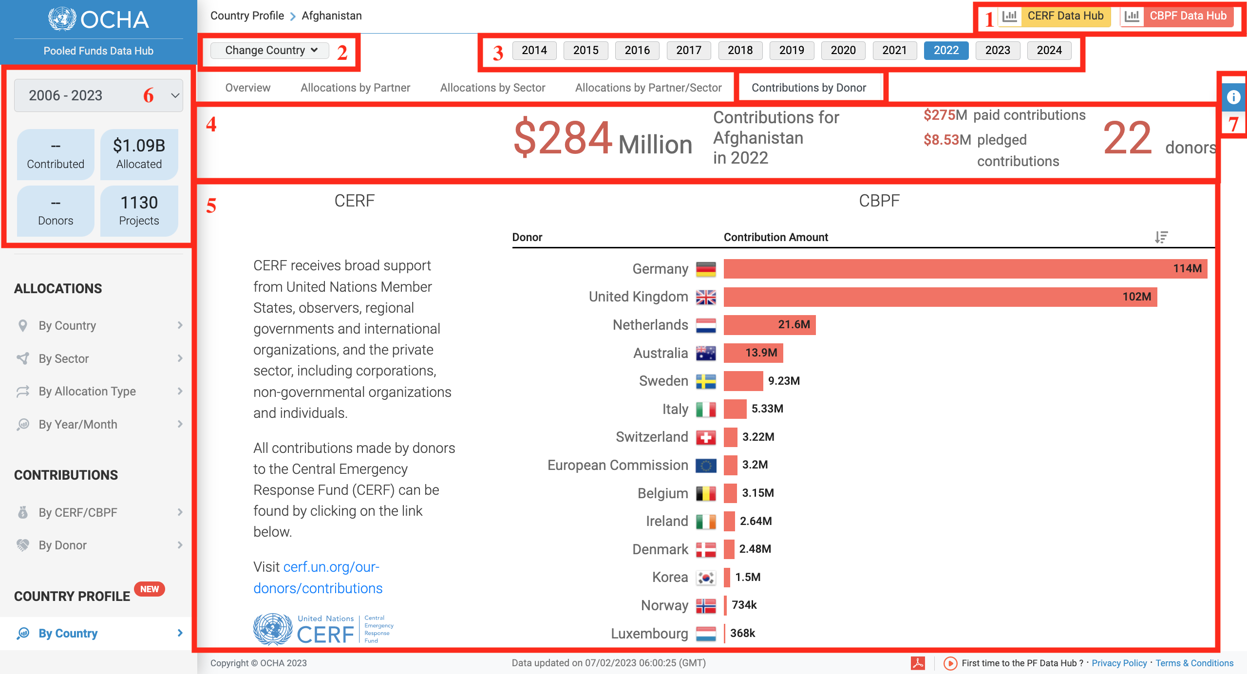
- Click on either of these icons to be redirected to their dedicated Business Intelligence platform for more information.
- Click on this drop-down to select another country and open its profile.
- Select the year.
- This is an overview of the donor’s contribution and the number of donors that contributed to the country.
- The bar chart displays contributions amount by donors. You can hover over the bar to show the donor’s paid and pledged amounts.
- This section provides information on the total amount allocated and total amount of project funded by CERF and CBPF in the given country since 2006.
- Hover over this icon to access the options' panel, from which you can extract the data as an Excel sheet (.CSV), as an image (PDF or PNG) or see an animation of the data throughout the years.